
Enable users joining Sky TV and broadband online ease of interaction, guiding them through end-to-end with clear information and usability.
How will you watch the entertainment you love
Project overview
My role
I led the end-to-end experience from discovery to implementation.
I conducted and analysed research and user testing sessions to understand the problem points and validate design decisions. I created wireframes all the way through to final product designs that met both user and business needs.
Timeline
October 2023 - present
Measuring success
An increase in online conversion numbers and a reduction of drop-off on significant join steps.
Opportunity statement
Increase the number of conversions in the end-to-end funnel where we were seeing up to 60% drop off on significant pages
Competitor analysis
Diving into the market and taking a look at join and buy journeys, uncovering what’s done well and what we can improve on.

User journey “big thinking” workshop
We got the team together and zoomed way out. Looking at the journey as a whole and focusing attention on areas of improvement, moving around, culling and drawing-board ideation.
Discussions led from gathered insights of customer/testing feedback and business future visions.
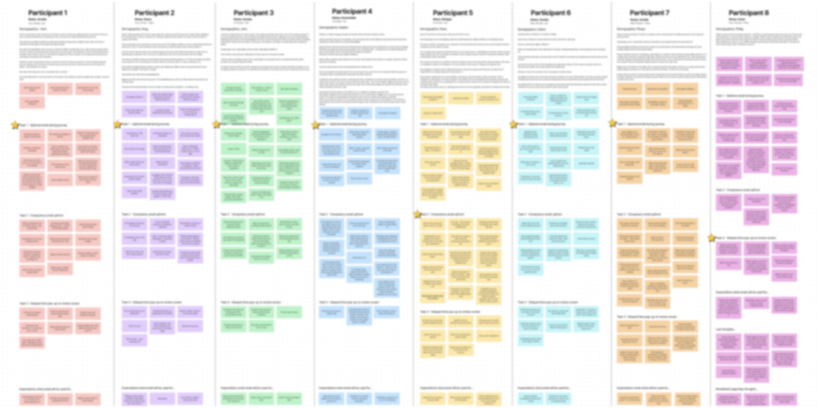
User testing
Four rounds of moderated and unmoderated usability testing sessions with users across mobile and desktop devices helped us to validate our design decisions.
We asked our users to complete tasks with the prototypes whilst we observed their behaviour, patterns, feelings and abilities to make their way through proposed design solutions.
Valuable insights came out of multiple rounds, noticing collective patterns and behaviours.
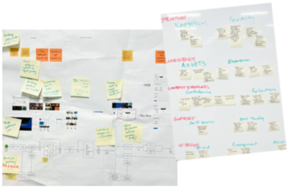
Affinity mapping
Gathering all of the user testing feedback into themes. We wanted to find the repeating patterns to place each category against a matrix determining highest user value which we would take to tackle first.

Final MVP
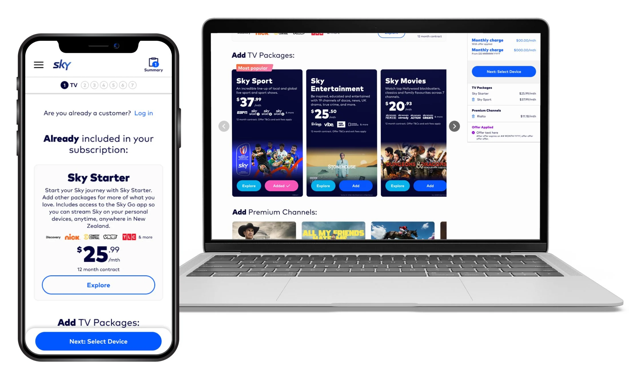
TV content page
All the content on one page so it’s easy for users to pick and choose what they want to watch on TV in their subscription
Content driven TV package cards, a more effective way to show a glimpsed feature show you’ll be able to watch right away with that package
Clearer, direct information, we want this to be exciting, not a T&Cs
Icon in the top right on mobile for ease of viewing order summary pricing and charges. No more repetitive scrolling from top to bottom of the page
TV Devices page
Users are required to choose a device to watch on their TV.
This new design allows users to get the comparative information they need all on one page, no more lengthy pop-ups for primary device or additional device selections
A sticky CTA bar at the bottom of the screen on mobile allows ease of moving forward to either of the next steps once they’re done here

Fibre broadband & add ons page
Check your address, choose your broadband then select your add ons.
Move to the next step at any time with the sticky CTA bar at the bottom of the screen on mobile
Usability tested new approach to add ons and customising your plan

Review page
Allow users to summarise their chosen subscription charges to make sure they’re happy before filling in all the detailed bits.

Takeaways
Meeting goals
This project involved a lot of research, ideation and user driven design decisions to meet the business goals and user experience opportunities
60%
increase in conversion rate since we started delivering this work
Watch this space…
This project will keep being optimised upon and we are currently doing discovery and concepts to make this an even swifter join journey